Theme Customizer
Overview
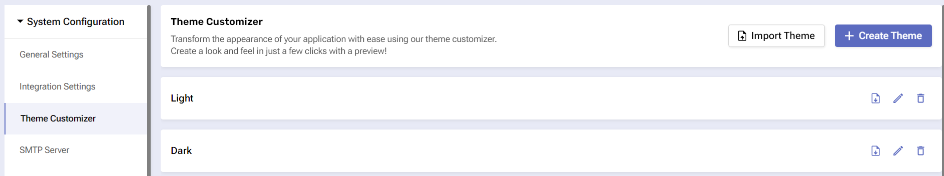
This is where you customize the look of your Platform interface. You can use the two default themes or create and apply new ones based on your preferences.
Before you begin
You can access the theme customizer by navigating to the System Configuration button and then clicking on Theme Customizer.
We recommend that you follow this logo image and asset specifications:
Recommended size: 600x220px.
Recommended minimum size: 80x44px.
Ratio: any ratio is supported if it’s close to 3:1.
Recommended maximum file size: 8 MB.
For browser icons, the file can be PNG, JPG, or SVG.
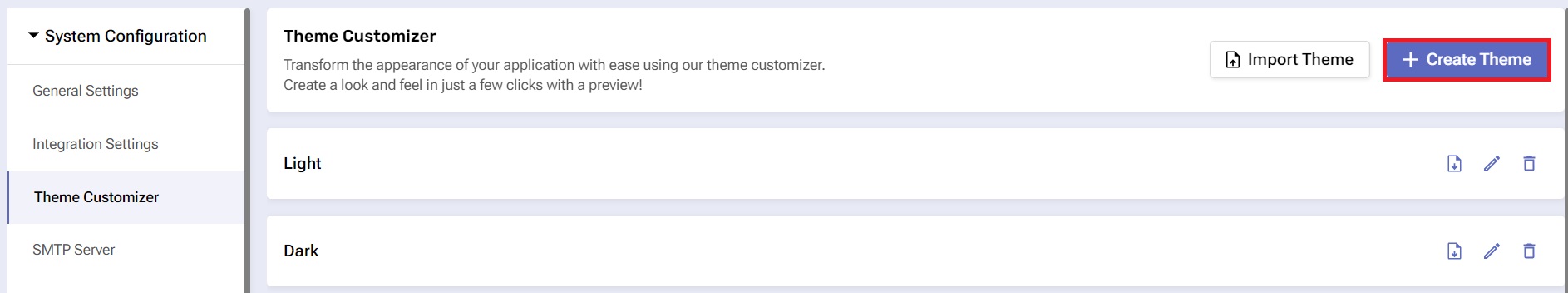
Creating a theme
You can create as many themes as you need. Each will have a unique profile that you can edit, delete, or apply instantly.
To begin, click the Create button.
You’ll be taken straight to the Customizer module, which can be divided into two parts: Theme Details (left) and Preview (right)
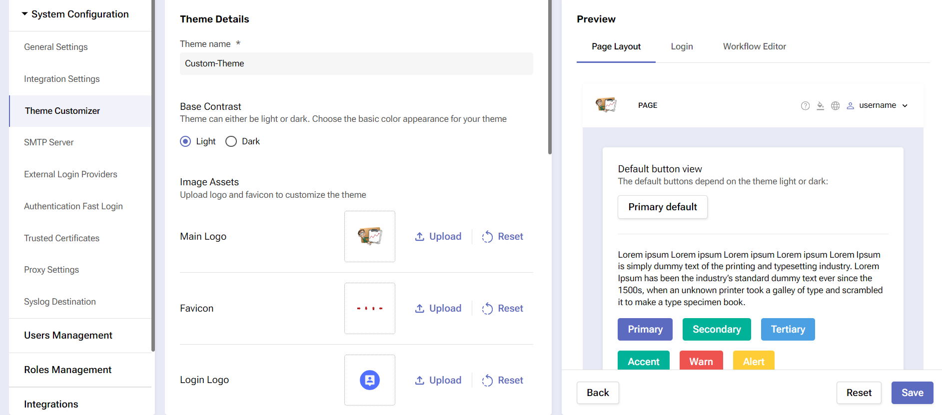
On the left side, you can build themes from scratch by selecting the main image assets and custom color settings.

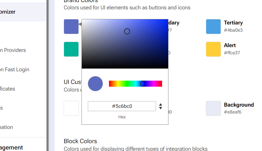
Click any of the squares to change the colors and/or their hue.
You can create your custom theme by defining a large selection of properties and assets:
Setting | Function |
|---|---|
Theme Name | Here you can define the name of the theme. |
Base Contrast | You can define the base contrast as light or dark. This will affect the Background and foreground colors as well. |
Image Assets | Here you can define the associated image assets including the default logo, favicon, and the background for the login page. |
Page Title | Here you can enter the name of the sample page used for creating the theme. |
Brand Colors | Here you can define the main, secondary, and tertiary colors of the platform, affecting elements such as buttons and icons. |
UI Customization | Here you can define the colors that paint main UI elements such as backgrounds and texts. |
Block Colors | Here you can define the color types of integration blocks - backgrounds and texts. |
On the right, you’re able to preview what your new theme will look like in real-time using each of the available three tabs
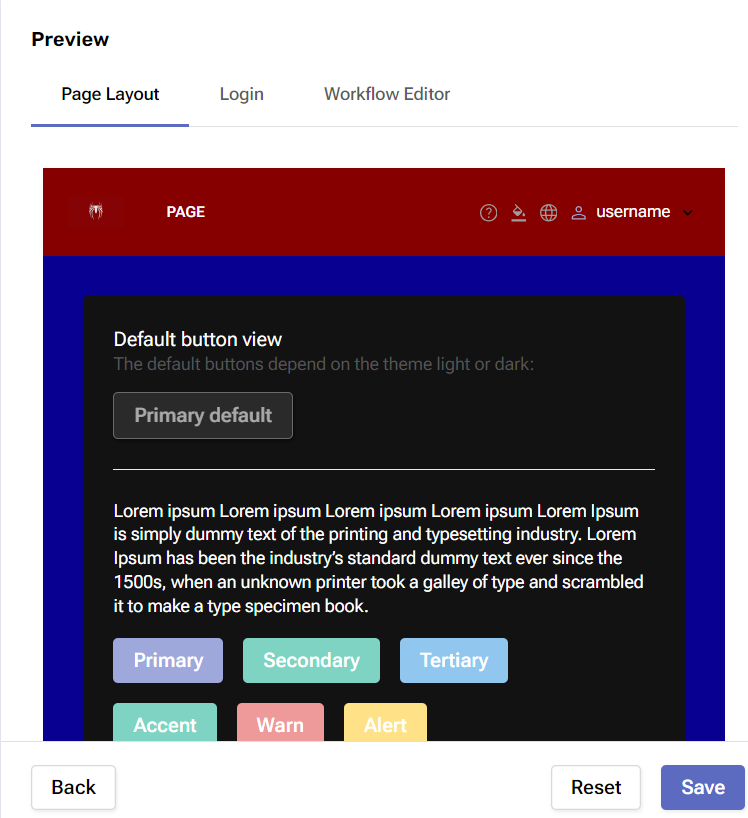
All tabs offer individual previews corresponding to their names.
For example, the Login tab will visualize elements of the login page affected by your new theme.
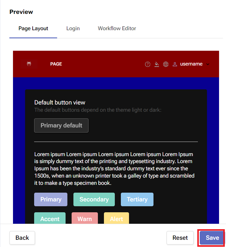
When you’re ready with the customizations, click the Save button at the bottom of the page. Make sure you’ve provided a name for the new theme.
NOTE
Saving, generating, and deleting themes may take up to 5 minutes.
Theme Actions
You can perform different actions on your existing themes.
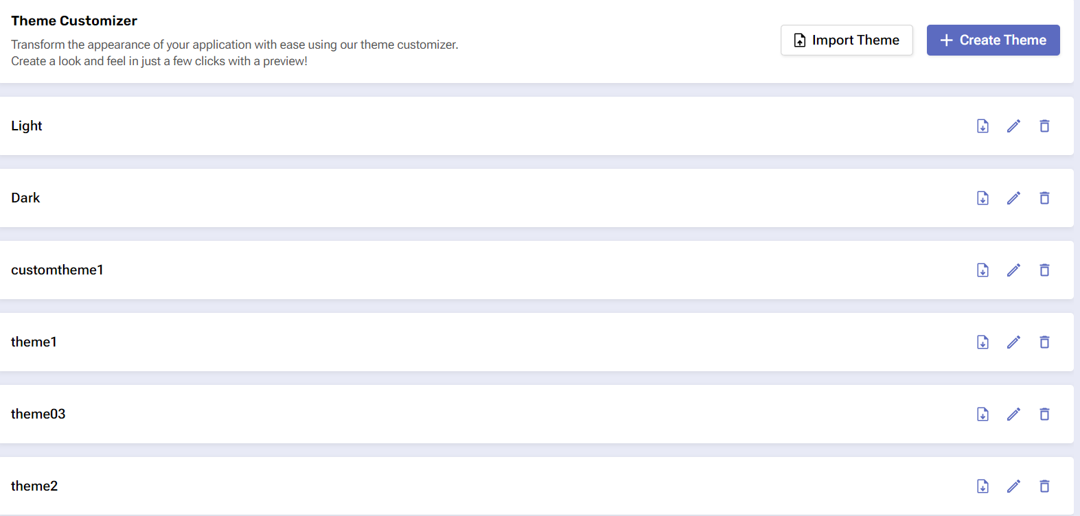
Import Theme – Click this button to select a previously exported theme from your local computer. When it is selected in the user interface, the editor will automatically open and allow you to make changes before it is saved to the platform.
Edit - If you click the pen button, you’ll be taken to the Customizer page where you can change a theme’s current settings.
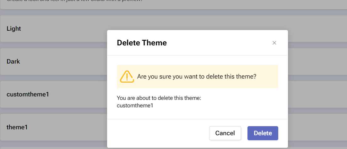
Delete - If you click the trash bin button, your theme will be permanently removed. A confirmation message will pop up.
Export – If you click the floppy drive button, you can save the theme to a local file in JSON format.
Applying a theme
Once created, new themes appear on the Theme Customizer page.
However, you can’t apply your theme from here.
Click the Color Scheme button. It’s the bucket icon located at the top-right corner of Pliant.
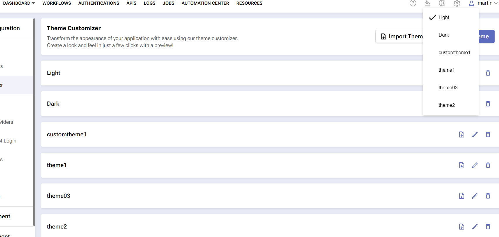
Choose your new theme from the list to apply it.